Laie: Redefining the shopping experience
A web redesign aimed at improving the usability of Laie's e-commerce platform.
Overview
| Role | In-house UX/UI designer at Laie |
|---|---|
| Platform | Web responsive | Timeline | Continuous iteration since 2020 |
| Tools | Adobe xd |
Introduction:
Laie specializes in managing bookstores and cultural-related stores. With over forty years of experience, it collaborates with 25 institutions and manages 30 stores. This project details the redesign process and usability improvements implemented on Laie's ecommerce platform.
For confidentiality reasons, I have omitted the specific scope of the project and left out most of the strategic decisions that are still pending implementation from the case study.
View live websiteObjectives:
- Improve mobile and web usability
- Streamline the book purchasing process
- Address external and internal complaints about the experience
Project challenges:
- Lack of sufficient analytical data to deeply understand user behavior.
- Starting from a design that, despite being responsive, did not offer an optimal experience for mobile devices.
- Short time since the last redesign, with so many changes, loyal users may feel confused if the changes are too drastic.
Research
Identifying Structural Issues
I conducted extensive research to assess the current state of the web. This process allowed me to question the need for certain sections or information and the importance of displaying content that was not present on the website.
Comparing Experience with Competitors
Together with the marketing team, we compared the overall experience with other similar websites, measuring the performance of our website, especially the discovery to purchase process and guidance during the checkout process. Through these comparisons, we discovered that the experience was confusing, lacked sufficient feedback, and was difficult to navigate compared to other solutions.
Analyzing Current Experience
The next step was to analyze the existing flow to uncover any critical or obvious usability issues through heuristic evaluation and contrast the results with analytical data. Thanks to this exercise, we were able to narrow down the redesign based on severity and prioritize the sections and pages that needed urgent improvement with the goal of providing a frictionless shopping experience.
Key Findings
Responsive but Not Mobile Friendly
The website adapted to the device screen size but did not provide a good mobile experience.
Key Examples:
- Unsmooth navigation, the burger menu collapsed, and scrolling was not possible, forcing users to collapse one category before expanding another.
- Automatic resizing without considering page design: images did not fit well into space and content, labels went unnoticed, and buttons with unclear CTAs were small.
- Desktop-inherited page structures, which, due to the large volume of content or complexity, were difficult to use on mobile.
Impact: If the website is not optimized, many mobile users may abandon it before starting to browse.
Unclear Checkout Process, Lack of Defined Journey
In the purchasing process, the most usability errors were detected, and the bounce rate was highest; the pages of this process were confusing and did not convey trust.
Key Examples:
- The website lacked a mini basket widget; clicking to buy opened a new page with the shopping cart, losing all progress made up to that point.
- The page did not display a clear CTA; there were only options to empty the cart, 'next,' and 'continue shopping.'
- The information about the checkout process steps was displayed below all the information, and although technically present, it was almost imperceptible.
- A very intrusive notification about payment charges appeared, seeming like an error.
Impact: Usability issues, lack of clarity, and trust in the checkout process directly impact the cart abandonment rate.
Inconsistent Information Architecture
We started with a highly segmented and poorly hierarchical information architecture.
Key Examples:
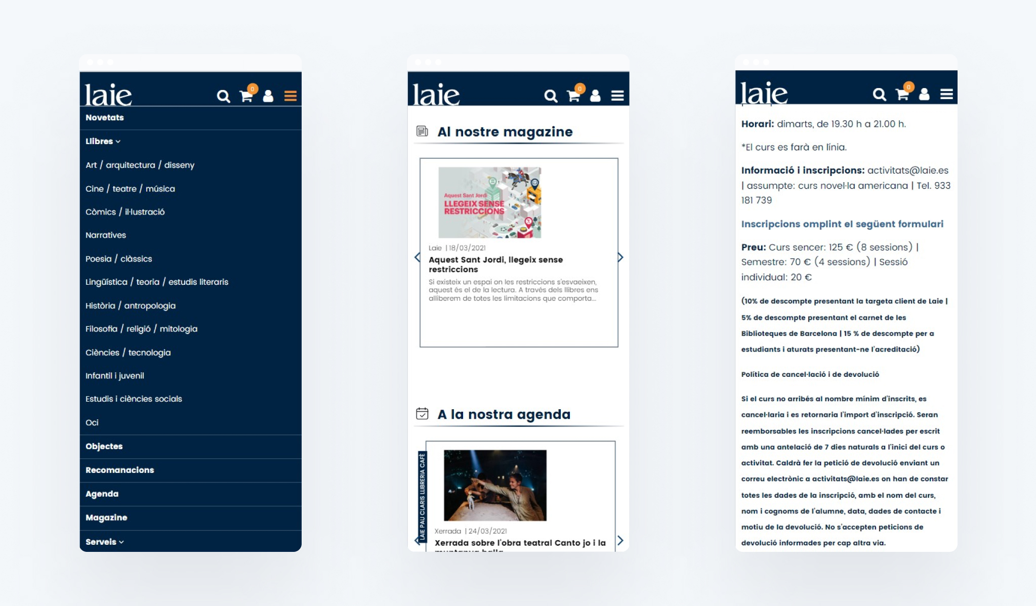
- Inconsistency in design: The navigation menu collapsed when scrolling, becoming a dropdown menu where some sections were not visible. In the mobile version, however, the main menu was better categorized, and all navigation items could be seen. This inconsistency between versions could create confusion.
- Some navigation elements did not align with the website's perceived identity by users; for example, many users identified it as a bookstore, but the third navigation item was 'objects.'
- The lack of company information, along with inconsistent service explanations, made it difficult to understand the offering and goal.
Impact: Usability is reduced, and the ability to find relevant information effectively diminishes.
Search and Filtering Difficulties
Regarding search and filtering, the old website version offered poor performance, especially on mobile.
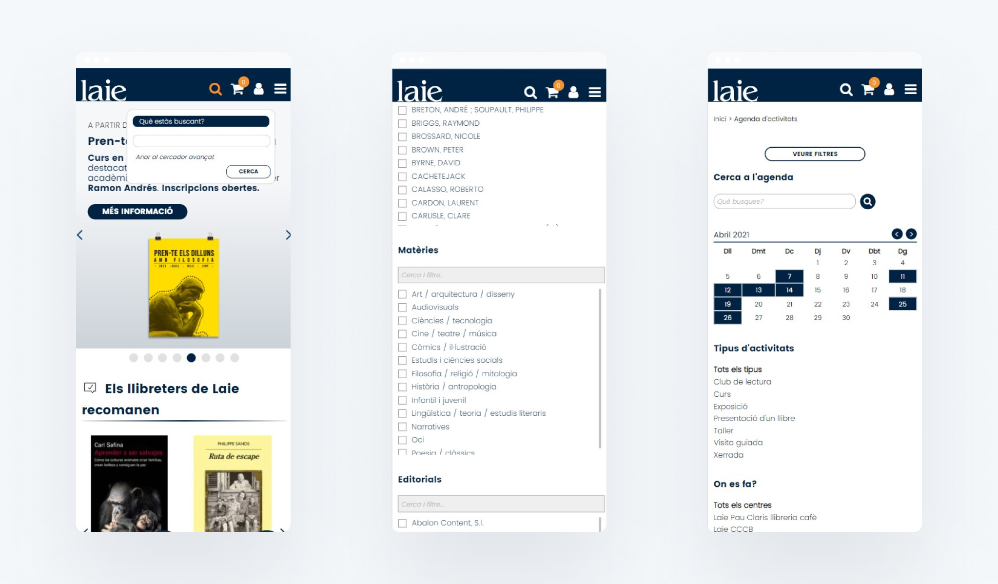
Key Examples:
- Search was not predictive and did not offer suggestions.
- The advanced search button was not very visible.
- Search on mobile was complicated; the search field appeared in a floating window, and both the text field and the search button were very small.
- The website did not inform about applied filters, making it difficult to remove them.
- The filters were not cumulative; on mobile, to apply more than one filter, the filter window had to be expanded again, and the action repeated.
- On mobile, to close the filter window, 'see filters' had to be tapped again.
Impact: Difficulty finding products can lead customers to our competitors.
Design approach
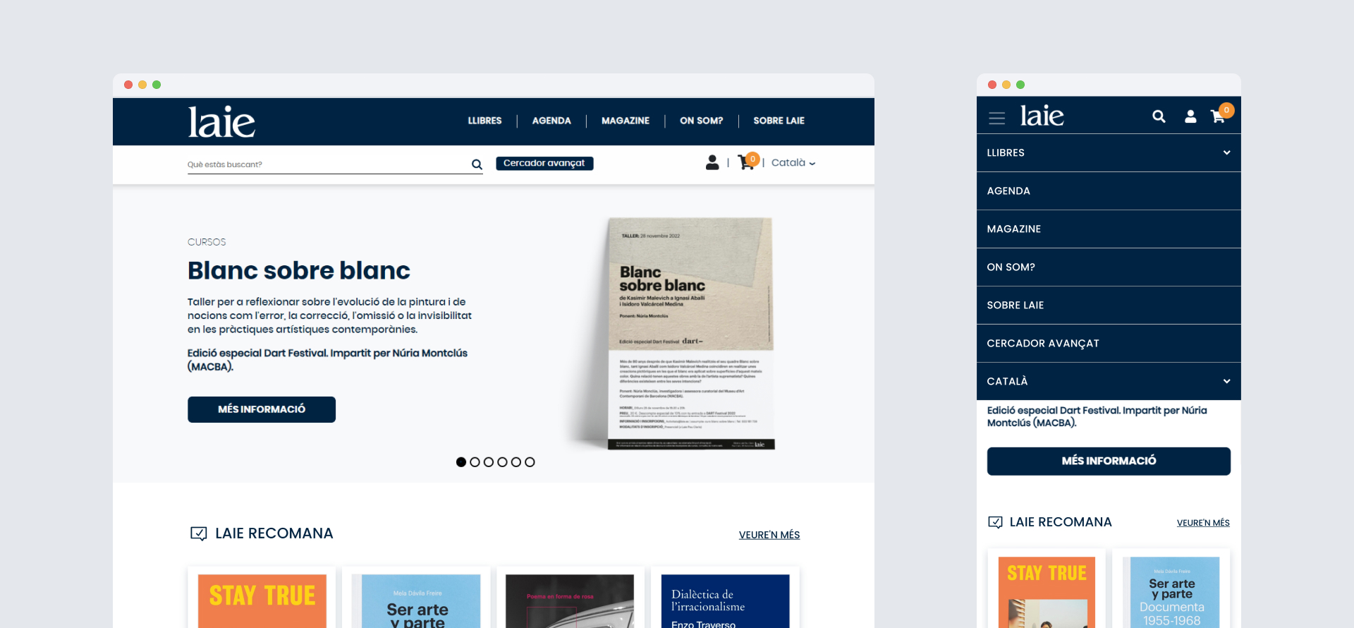
Organizing Information Architecture
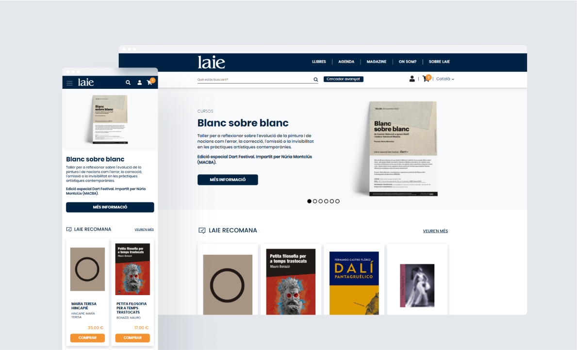
We modified the navigation menu by prioritizing elements hierarchically. Now, the first navigation item is Books, eliminating new arrivals and recommended as a category to avoid creating more listing pages. The links to these pages work bidirectionally with the home and through filters on the general book listing. The second navigation item is Agenda, prioritizing access to courses and activities taking place at the libraries and stores. The rest of the structure is relatively simple, and through various meetings with the involved departments, it was decided to: maintain the Magazine section (blog), display the list of stores and libraries through Where we are, and create an About page to provide information about the company, unify services, and add information about CSR.
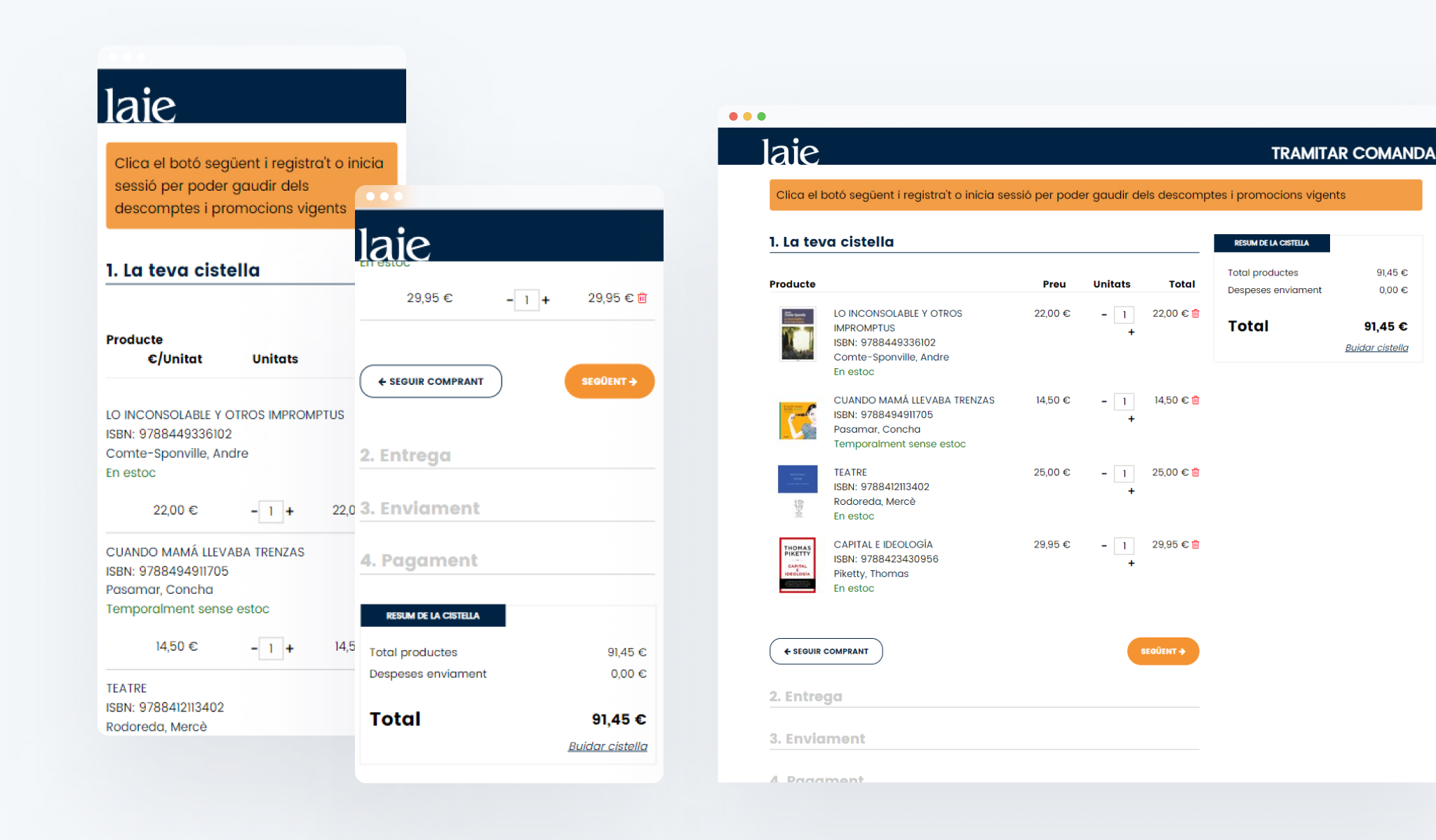
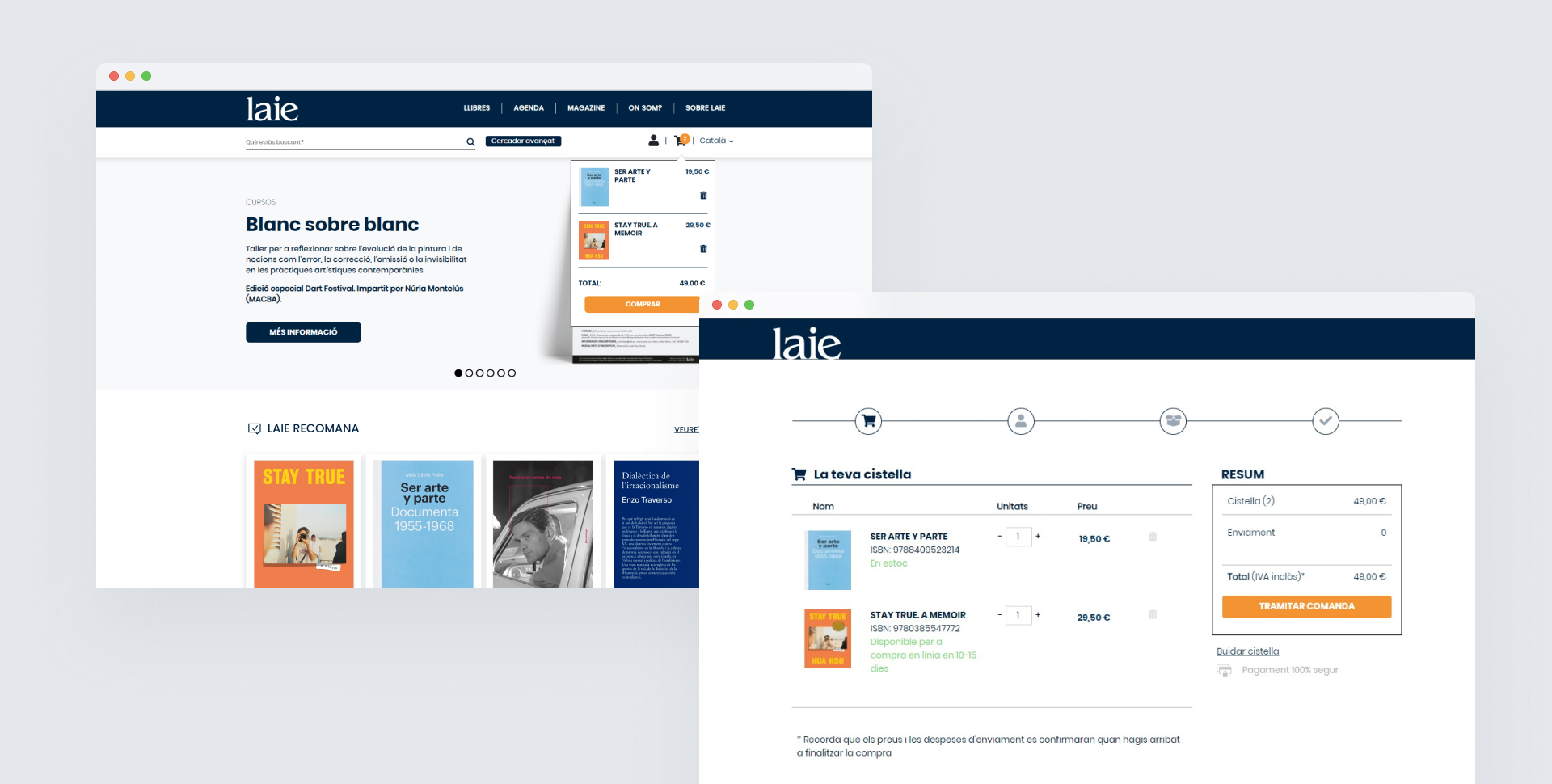
Optimizing the Purchase Process
To reduce friction in the purchase process, the following improvements were implemented:
- Using a mini basket widget through a dropdown to add products without leaving the page, offering the possibility to continue browsing, discovering, and adding more products.
- Providing immediate feedback each time a product is added to the basket by expanding the drop-down with the basket summary.
- Using a clear and visible CTA (proceed to checkout).
- Displaying product details and linking products to comprehensive sheets for detailed review.
- Including a progress bar showing how many more steps are left to complete the purchase.
- Displaying an order confirmation and status with shipment tracking or click and collect.
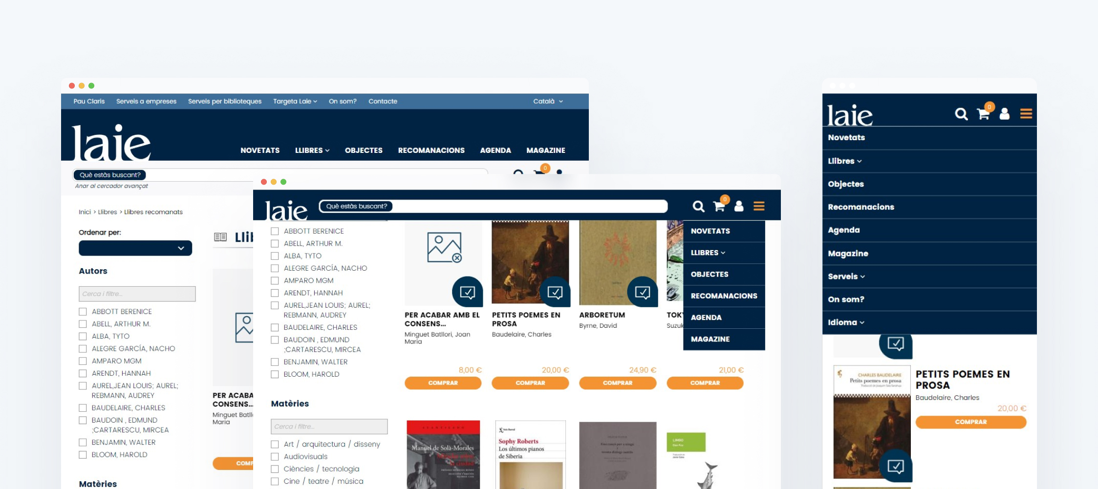
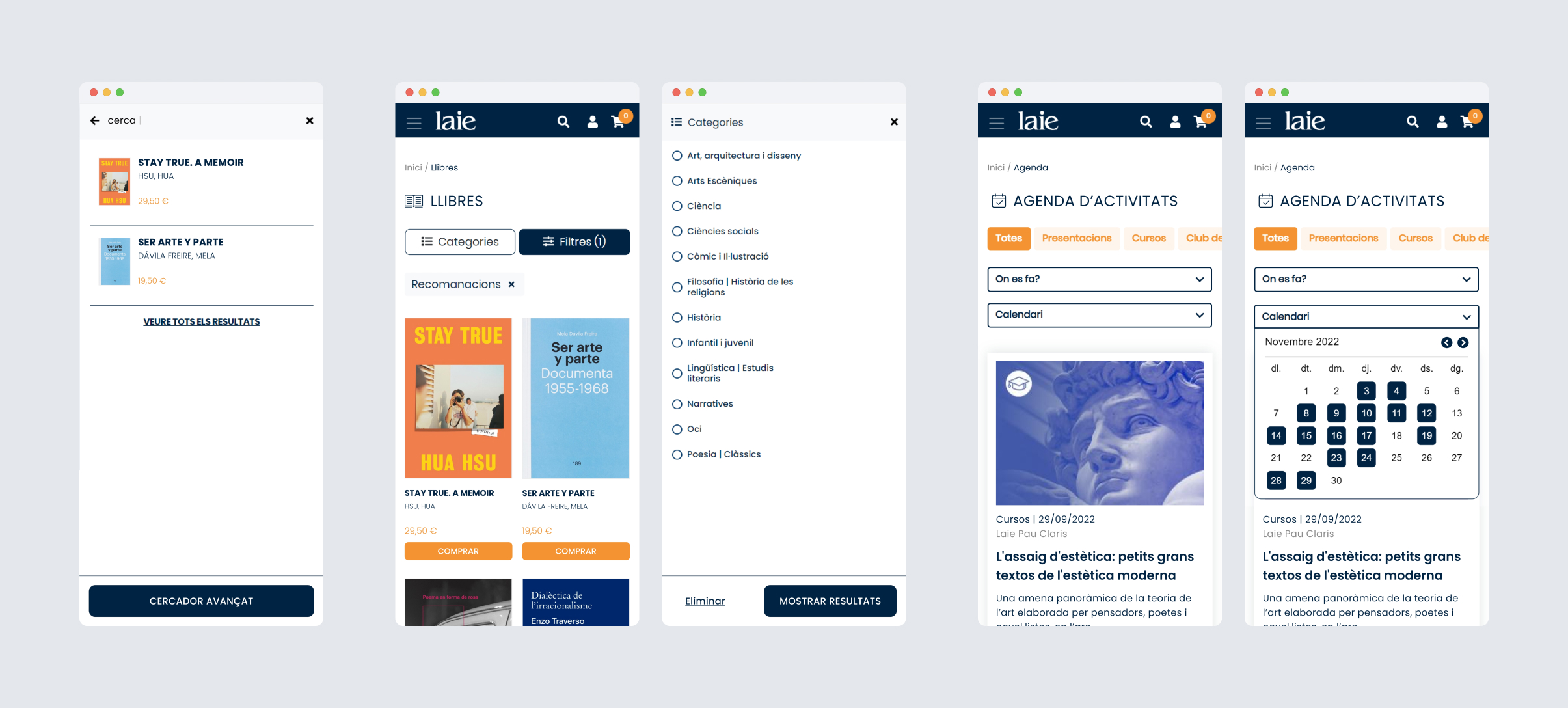
Enhancing Searchability
An important improvement on the website has been the incorporation of predictive search. With the aim of improving usability in search and filtering processes, I took a mobile-first approach.
- Improving the search area and offering predictive results.
- Highlighting the advanced search button and making it usable on mobile.
- In the case of mobile, adding a search page to facilitate text input, offer an exit, and preview predictive search results by linking to the page with all results.
- Separating categories from the rest of the filters, in the case of books through two differentiated buttons and in the case of the agenda through chips with the type of activity.
- Providing cumulative filters to avoid repeating the action.
- Always adding the option to reset and close the filter window.
- Displaying applied filters and the deletion icon.
Reflection
This project was one of my first opportunities to fully focus on improving the user experience, dedicating more time to prototyping and testing designs internally. This gave me the chance to gain more experience in the field of UX.
Although making drastic improvements was relatively easy, given the poor original state of the website, I felt proud to have made an impact on the service. The process of identifying usability issues and understanding how to improve the structure was a rewarding experience.
It would have been interesting to have more time and resources to use people-centered design methodologies during the ideation and evaluation phases, involving end users directly.
During implementation, I missed having better communication with the front-end developers to ensure a better implementation of the designs.