Homing: Crafting seamless adoptions
Interface design and creation of a UI Kit for a pet adoption web platform, making the adoption process as smooth as possible.
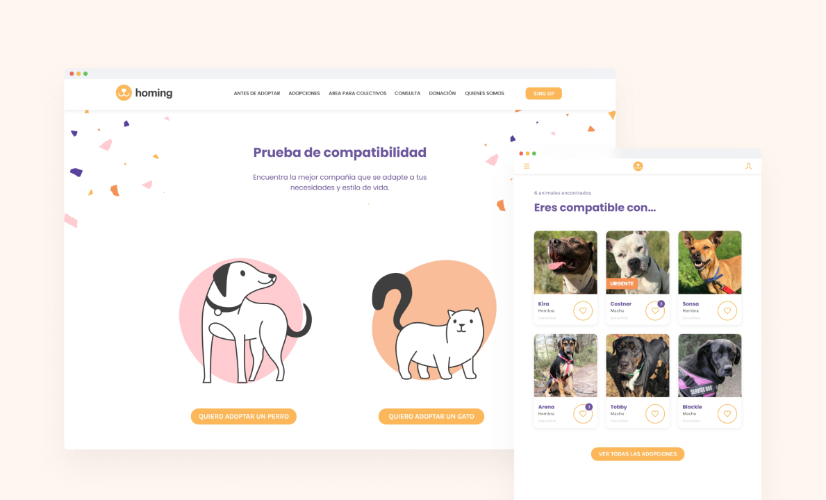
Overview
Overview:
Homig is a responsive web platform created to connect animal shelters and rescues with people interested in adopting a pet. Designing an experience that helps individuals find the right pet for them, considering both the person's lifestyle factors and aspects of the pet.
View Final Prototype
Briefing
A briefing is received with the results of the research phases, ideation, and low-fidelity wireframes, and it is requested to design the identity, interface, and creation of a UI kit that allows for the scalability of the product. As well as prototyping key functionalities and an initial evaluation with users.
Objectives
- Homing aims to find the best match between potential adopters and pets, helping individuals find a pet that fits their lifestyle.
- Reduce the abandonment rate of pets by providing information and education to adopters about their responsibilities.
- Simplify, facilitate, and make the experience of potential adopters on the platform comfortable.
Challenges
- Finding the ideal pet can be a laborious process for many people, requiring the need to review various sources of information and make important decisions.
- It is crucial that information about available pets is presented clearly, simply, and accessibly, as otherwise, people may abandon the adoption process.
Design the user interface
Creating the Emotional Experience
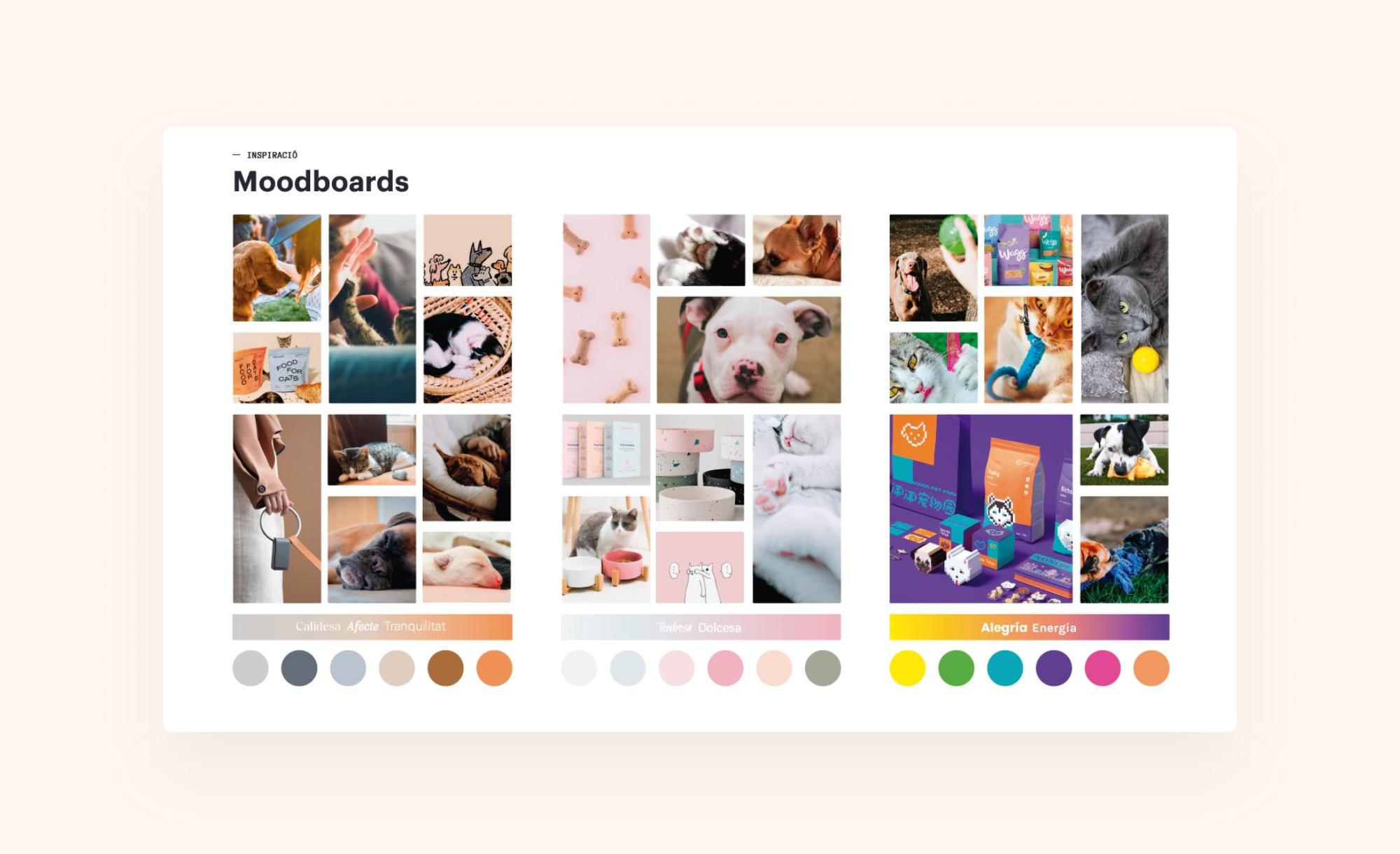
Building upon the research and ideation outcomes gathered in the briefing, I began to search for references aligned with the key concepts that the solution needed to communicate. In this initial phase, I developed several mood boards to translate emotions into design resources.
Identity Construction
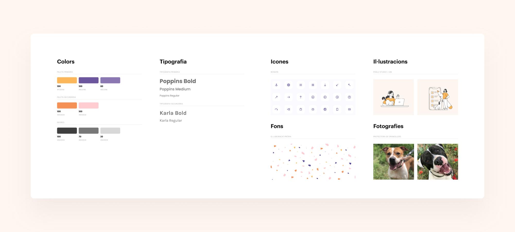
The color palette arises from the study of references and previous moodboards, as well as the derived concepts for the Homing platform: hope, dynamism, optimism. Thus, the primary colors are saturated and have contrast, complemented by orange and pale pink to reinforce a warmth feeling. Typography and branding go hand in hand with this style, featuring rounded lines and a clean, minimalist aesthetic.
Illustrations have been preferred over photographs to avoid confusion with other content. All images of animals available for adoption are real to make the design 'as real as possible.' The background is inspired by the second moodboard, featuring a terrazzo pattern that conveys joy and vitality.
The Brand
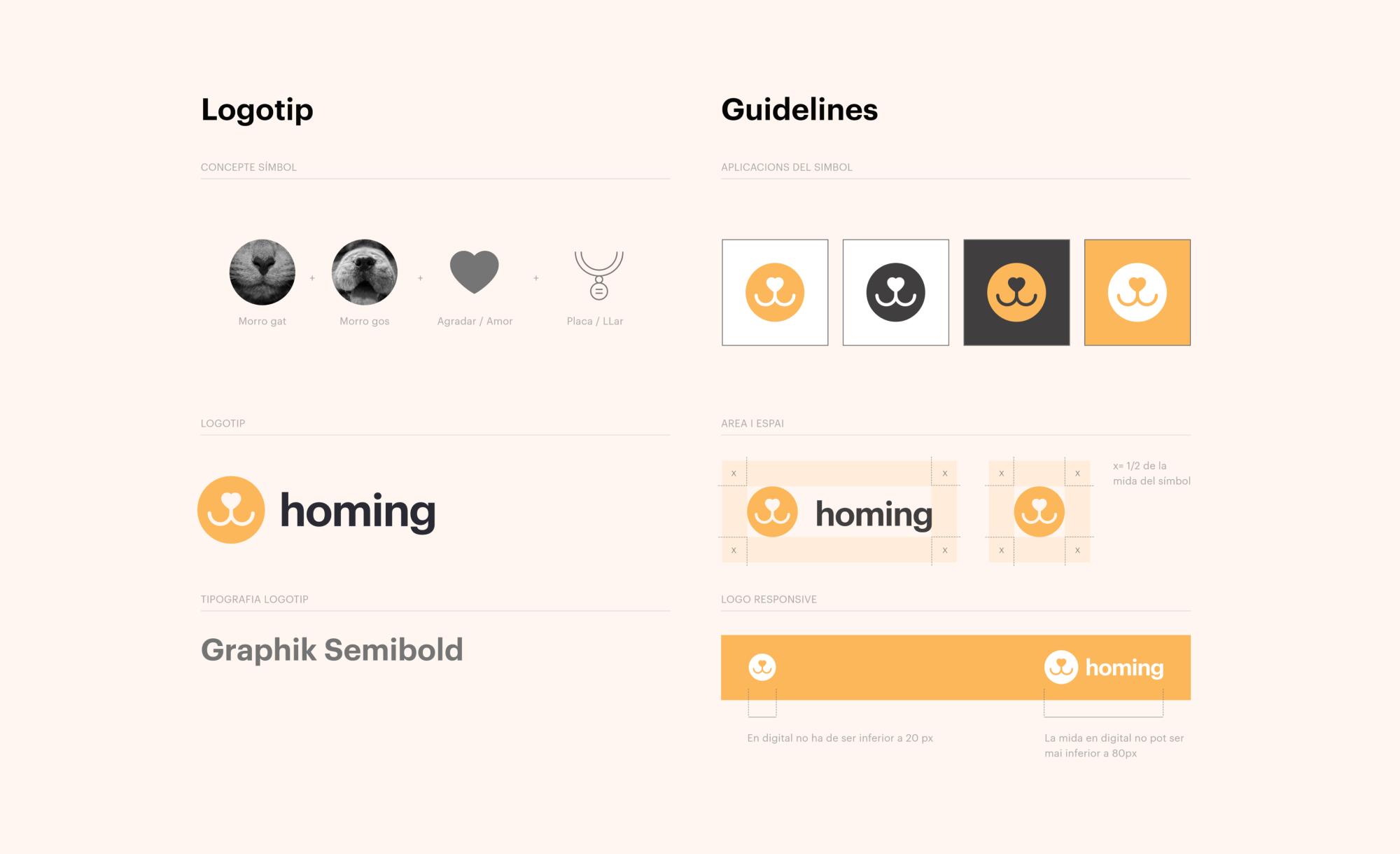
The development of the brand goes along with the graphic style. The chosen typography reinforces the identity of Homing, creating a brand distinct from the page's content. Various applications of the symbol have been proposed to ensure good contrast and adaptability to different screens.
Responsive Grids
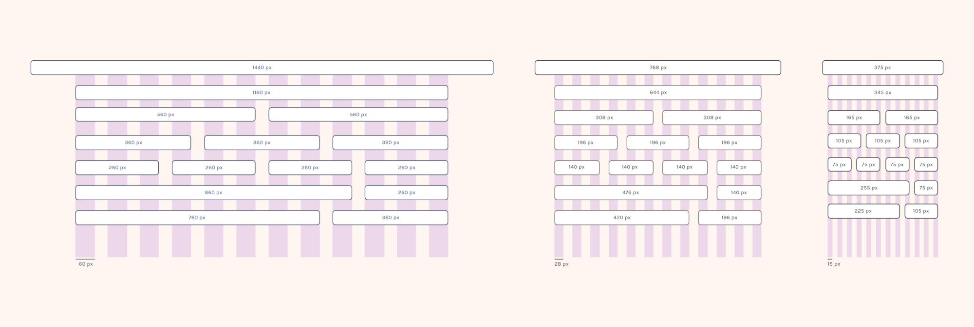
Responsive grids are designed to ensure that the layout adapts proportionally to all surfaces. The three breakpoints share 12 columns, providing versatility to the design.
UI Kit Design
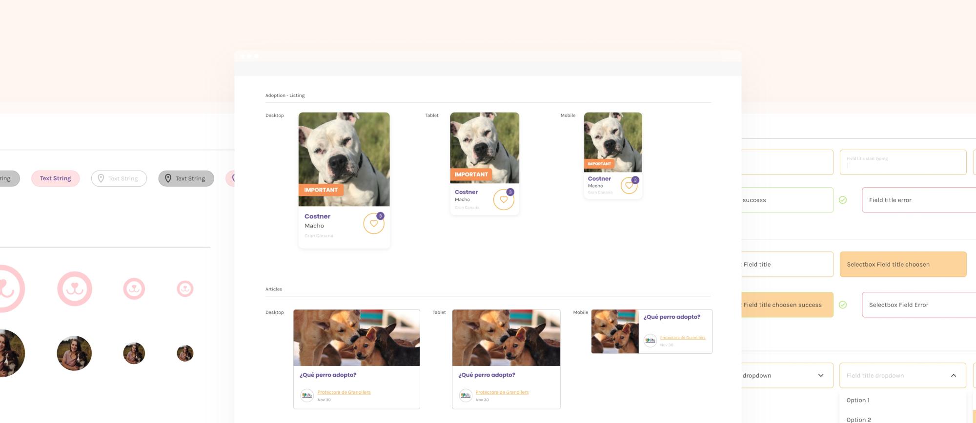
The development of the UI Kit was a crucial part of creating Homing, ensuring visual consistency and offering a coherent experience throughout the platform. This collection of components and design elements was conceived with the aim of providing a solid foundation for building all screens and interactions. Furthermore, its modular structure facilitates the scalability of the product.
Prototype
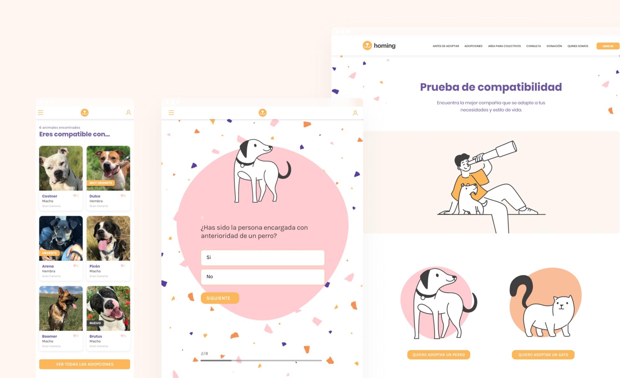
In order to test the design solutions, I prototyped the main screens of the compatibility test flow across the 3 breakpoints, using the UI components.
Test and iterate
User Testing
After creating the prototype, usability tests were conducted with 4 people, following a detailed research plan that established objectives, KPIs, and methodology. The main goal was to ensure that the compatibility questionnaire flowed smoothly and generated interest in adopting an animal.
The task involved completing the compatibility questionnaire and reading an animal profile. This task was performed across the 3 breakpoints to ensure consistency across devices. During the task, users were encouraged to express their thought process and voice any confusion or frustration.
After the test, they were asked to complete a brief SUS questionnaire to evaluate the overall usability of the prototype.
Test Results
All participants successfully completed the task for each device, and an average SUS score above 80 points was achieved. During the test, qualitative data was collected regarding the overall experience and aesthetics. The idea of an affinity test to find a pet was well-received, as was the general look and feel of the website. There were very positive comments about the illustrations, hierarchy, and micro-interactions of the cards, but users encountered some difficulties completing the questionnaire and commented that the page was overly saturated with color. Similarly, the presentation of the adoption profile did not fully convince, described as cold and too similar to an e-commerce layout. There were also issues with the micro-interactions of the buttons: too subtle, they went unnoticed. The header images on the 'before adoption' pages were also criticized for being too large and obstructing access to two buttons.
Revisions and final ptototype
After collecting feedback and usability test results, a series of improvements were made for the final version of the Homing prototype, and adjustments were made to the UI kit components.
- Adjusting the design of forms to improve readability and reduce visual clutter.
- Reviewing the presentation of the adoption profile and adding more images of the animal.
- Redesigning the micro-interactions of the buttons to make them more noticeable.