HikingLog: Enhancing hiking experience
An application designed to enhance safe and personalized hiking experiences for outdoor enthusiasts.
Overview
| Client | UOC Master's Thesis |
|---|---|
| Platform | App MVP | Role | Product designer |
| Timeline | February-May 2021 |
Introduction
HikingLog focuses on the conception and development of a Minimum Viable Product, presented as a mobile application tailored for outdoor routes. It emphasizes customization and diversification, aiming to foster environmental respect and deliver personalized experiences. It considers users' skill levels and provides ample information about difficulty levels, serving as a platform for discovering routes, planning outings, and exploring natural parks.
View Final Prototype
Project Objectives:
- Identify the concerns, motivations, needs, and frustrations of potential users at beginner or intermediate levels in mountain sports and activities.
- Explore potential solutions to promote respect for mountain ecosystems and enhance the diversity of hiking options to mitigate overcrowding on popular trails.
- Design a system based on user feedback and skill levels to enhance safety in mountain sports and activities.
- Develop an MVP in the form of an interactive prototype, showcasing the application's core functionalities and features.
Research
I began the project with a desk research, analyzing and compiling various sources of information and relevant data for the project. The insights and conclusions from this initial phase were used to develop the project plan for the interviews, which constituted the first contact with users. Finally, I approached the study of competitors through benchmarking aligned with the needs, motivations, frustrations, and essential requirements of users collected during the interviews, prioritizing solutions where I could test the end-to-end process.
Desk research
Desk research involved exploring existing literature, hiking/mountaineering participation statistics, environmental impact resulting from overcrowding, and safety practices.
Interviews
My goal was to connect with users right from the start, getting a grasp of their current experience ('journey as-is') and understanding their mental models while capturing the terminology used.
Benchmarking
Benchmarking entailed reviewing and analyzing the leading existing solutions such as Wikiloc, AllTrails, and Yamap. I tested these solutions in their context of use whenever possible.
Ideation
The methods employed during the research phase provided me with a deeper understanding of whom the users were and how they could use a hiking application. I focused on expanding these findings and translating them into concrete visualizations that helped me empathize with users and define the product.
Key differences in motivations and needs
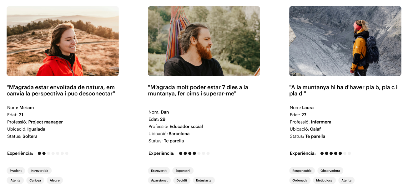
During the interviews, I was able to capture significantly different motivations and needs among the participants, often related to their level of experience. Using both quantitative and qualitative data from desk research and interviews, I defined three personas representing key aspects of the solution: explanation of difficulty levels, flexibility in planning or sharing, and searching for long-distance or multi-day hikes.
Most of the journey happens outside hiking
During the interviews, it became clear that a substantial part of the process involves exploring and planning a route. Decision-making isn't always straightforward and is influenced by factors like individual or group skill levels, the reliability of descriptions, and weather conditions. To capture these insights, I created an experience map, offering a detailed visualization of the journey taken by a 'generic' user toward their goal. This map delineates actions, emotions, and thoughts at each phase of the journey.
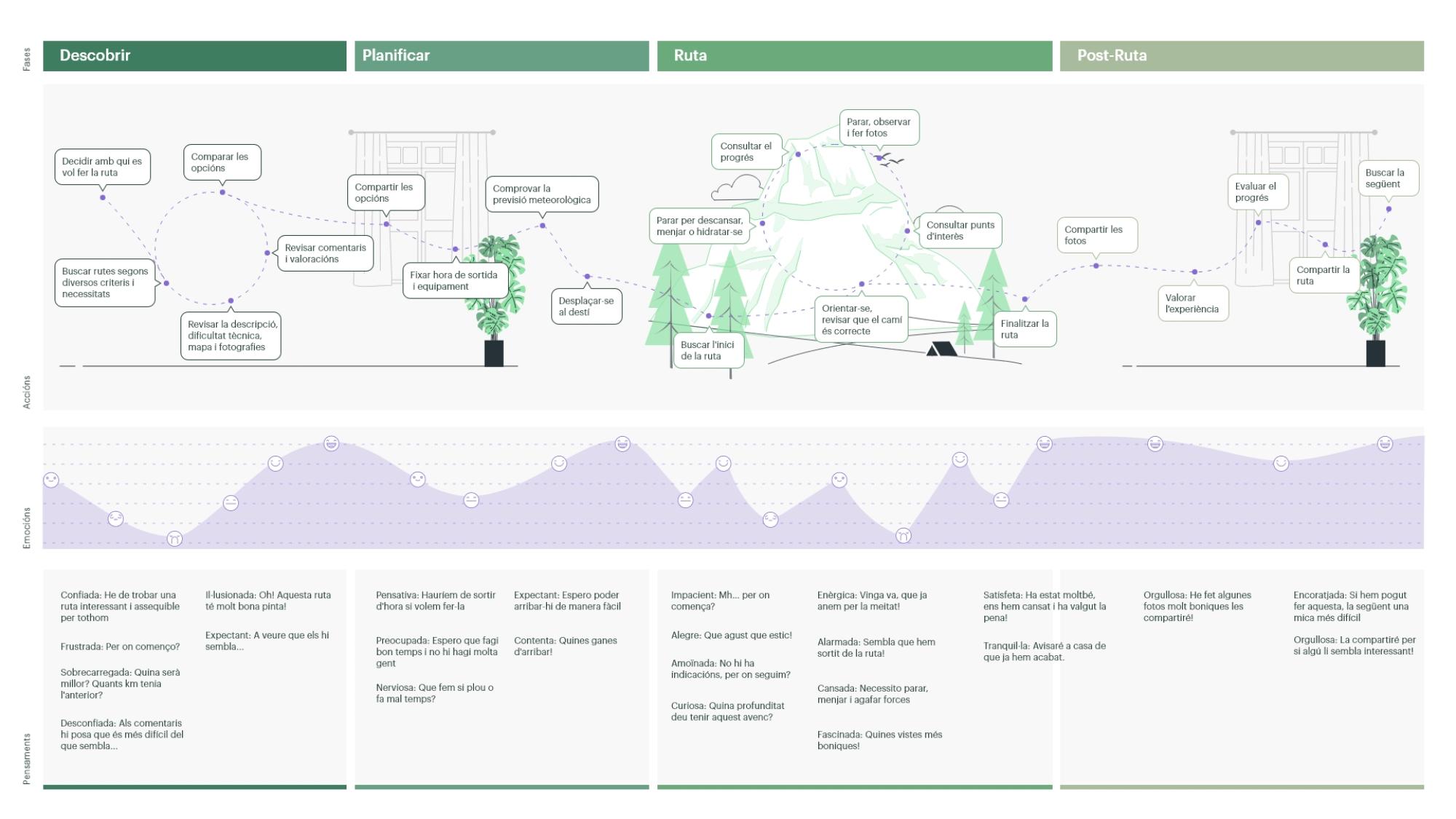
EXPERIENCE MAP (PDF)
Building empathy by exploring user experiences
To capture touchpoints and anticipate the main product functionalities, I crafted three scenarios linked to the three personas:
- Miriam: Searching a hike by level and guidance.
- Dan: Planning a multi-day hike.
- Laura: Sharing routes.
This methodology allows for the outlining of system functionalities within the context of use and representing key interactions between users and the product.
Key Findings
Thanks to the representations developed in the definition phase, I was able to compile and synthesize the gaps for opportunities and implementation ideas from the research phase, organizing them according to each stage of the experience map.
Define
Defining the structure
Drawing from the gaps for opportunities and scenarios, I compiled a content inventory aimed at developing a realistic MVP. Using this inventory, I conducted an open card sorting with the Optimal Workshop tool to create an information architecture aligned with user expectations.
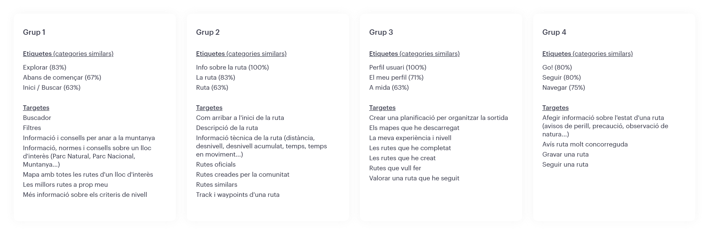
Content Tree
The content tree is derived from the results of the card sorting process, with the aim of providing optimal and straightforward navigation. The information architecture is structured into three levels of navigation: explore, navigate, and profile.
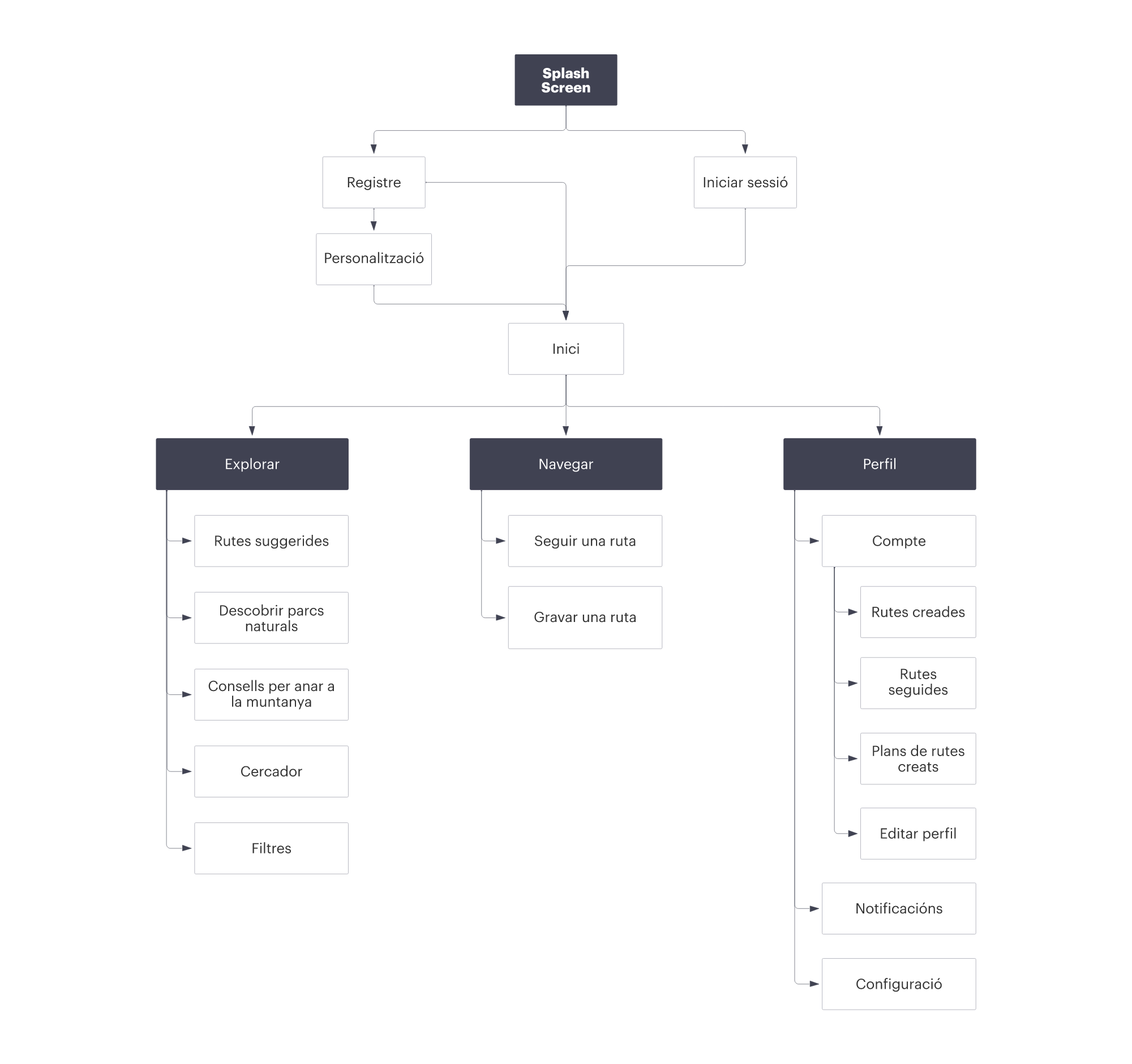
ARBRE DE CONTINGUTS (PDF)
Flow Diagrams
These diagrams illustrate the journeys described in the scenarios with certain modifications to avoid repetition in the filtering process and to diagram the navigation process. I also included a diagram depicting the registration and personalization process of the experience and expanded scenario 2 to demonstrate how to access the content tabs of Natural Parks and their use.
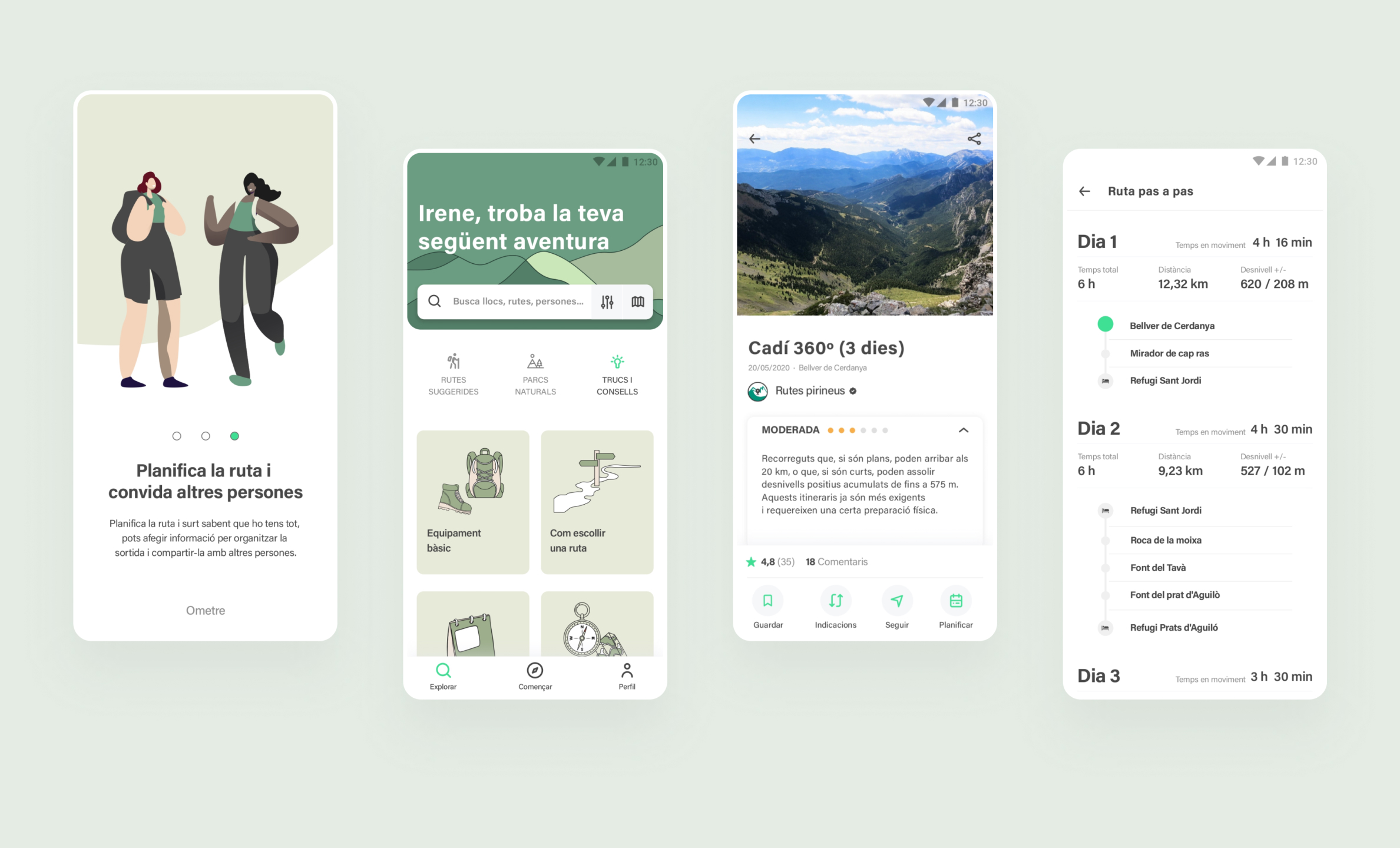
Prototyping
Wireframes sketch
To create an initial prototype and map out the information architecture, I sketched out the main screens. During research, I identified design patterns in the solutions assessed in the benchmark that helped me understand which elements should be included to ensure familiarity.
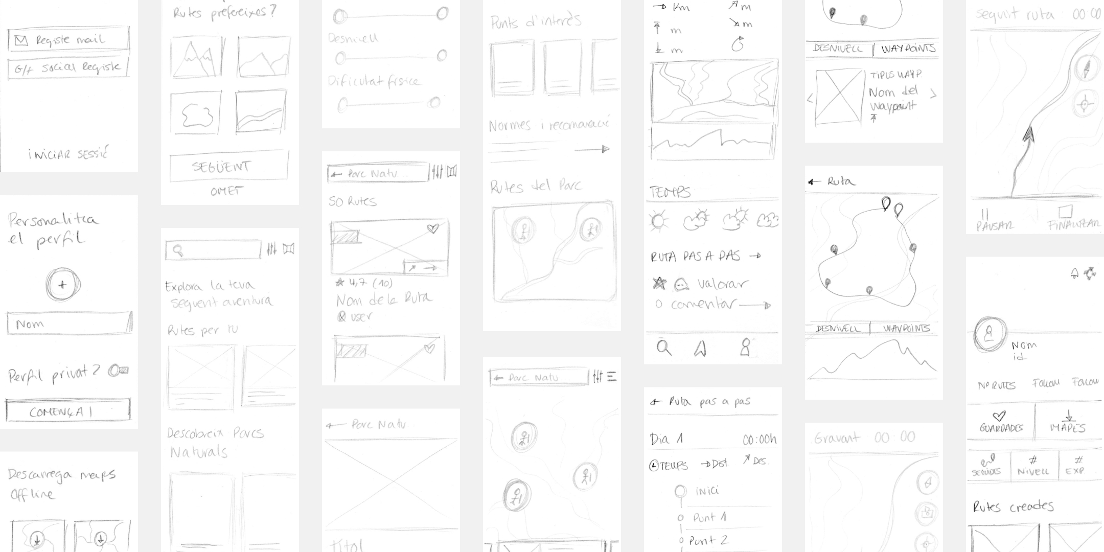
To identify errors early in the prototyping phase and avoid accumulation, I conducted a first click test on the sketches to assess their visibility, coherence, and placement in the design.
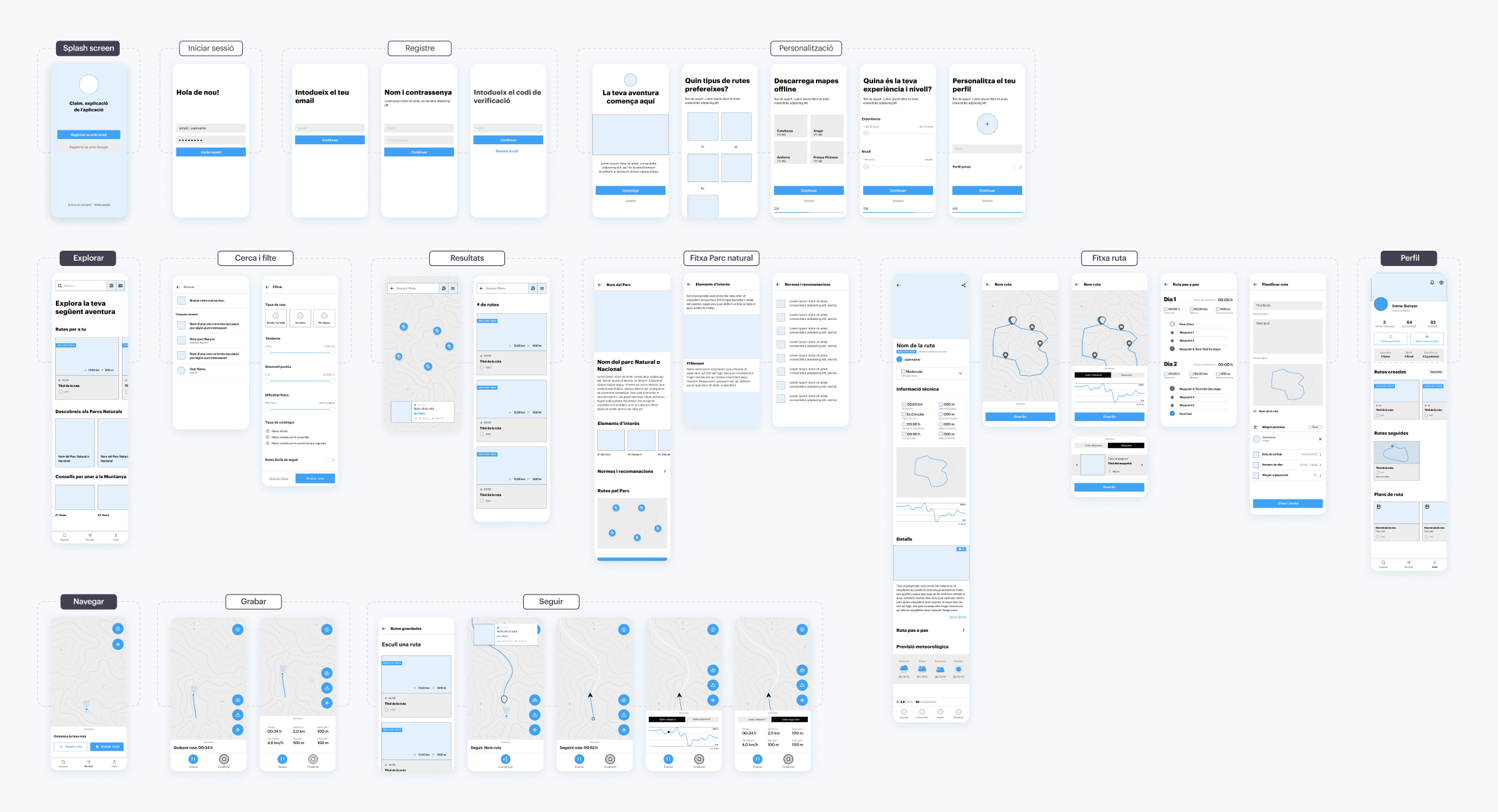
Low-fidelity wireframes
Based on the results of the first click test and ensuring solidity in the main navigation level, I designed the low-fidelity prototype, focusing on spacing and layout of elements.
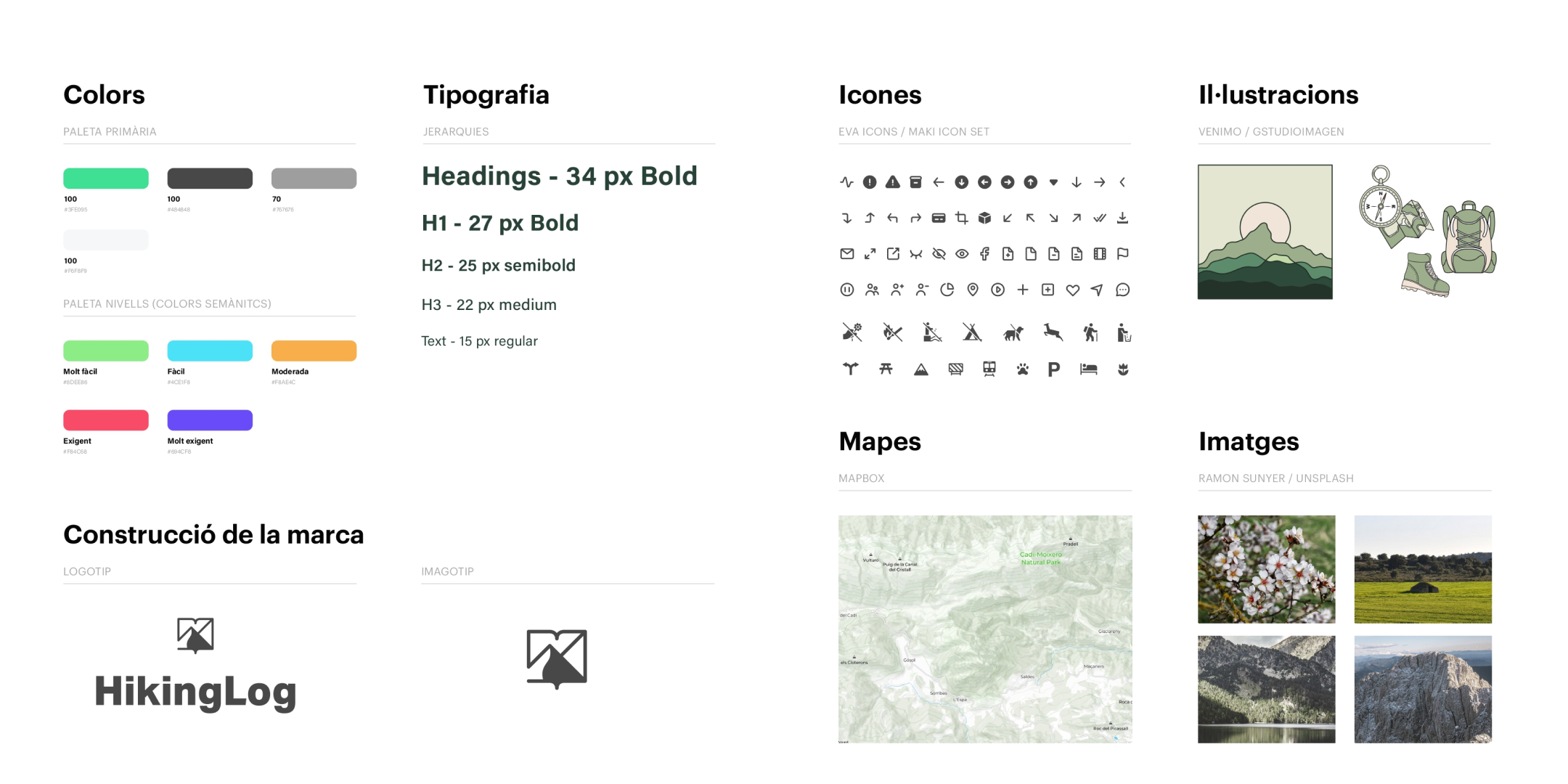
Identity Construction
Taking as a reference the solutions analyzed during the benchmarking phase, I opted for a clear and clean graphic style with a limited color palette to enhance the visual weight of images and facilitate access to information. I also developed a secondary palette associated with physical difficulties, a recurring suggestion during interviews.
Test and iterate
Heuristic evaluation
I recruited three UX professionals to conduct a heuristic evaluation using Nielsen's 10 heuristics. After thoroughly assessing the prototype, we held a joint session to review the results.
Usability evaluation
With the interactive prototype ready for testing, I developed a test plan defining objectives, methodology, KPIs, and task objectives.
Objectives:
- Understand users' first impressions and observe how they navigate through the application.
- Identify specific difficulties encountered when attempting to complete tasks while using the application.
- Identify barriers or confusion preventing users from achieving their goals.
- Assess the severity of issues detected in the heuristic evaluation.
Methodology:
Moderate remote testing via Skype
Participants:
- 6 users
- Aged between 25 and 30
- Interest in hiking with varying levels of experience
Tasks:
- Search for a nearby hike with low difficulty, easy to follow, and save it.
- Follow the route you saved.
- Record a new hike and add the desired information to the track.
- Search for a three-day hike in the Cadí-Moixeró Natural Park and find out if they can camp or need to sleep in a mountain hut.
- Create a plan for this multi-day hike and add information that may be of interest.
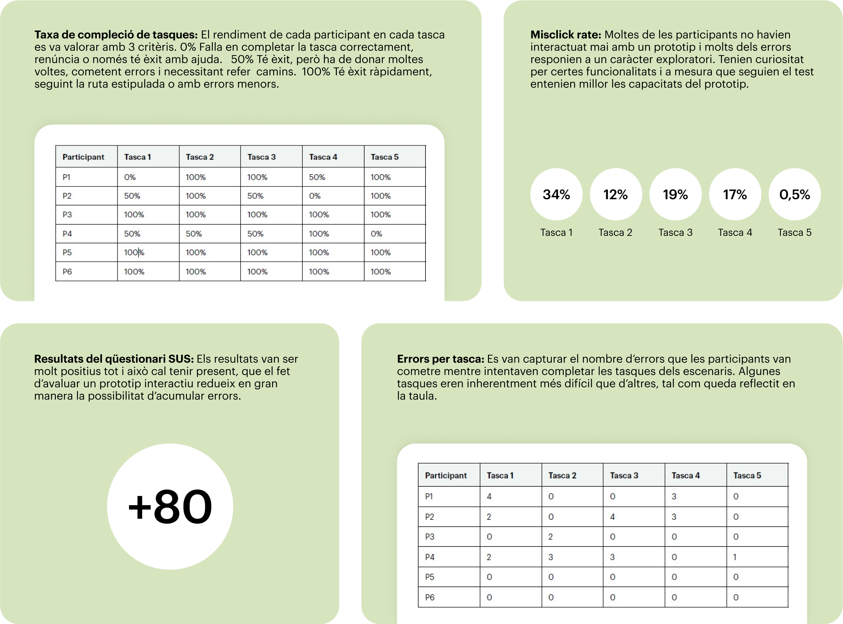
Results:
During the evaluation of the HikingLog prototype, several data points were collected providing a detailed insight into its usability:
- Most participants successfully completed the tasks, although the misclick rate revealed a notable frequency of errors, especially in initial tasks.
- Variability in errors per task reflected the diversity in participants' experience. However, the results of the SUS questionnaire were very positive, with a score above 80, indicating an overall favorable perception of the prototype's usability.
It's important to note that despite the high SUS questionnaire score, evaluating an interactive prototype may limit error detection, and continuous improvement and adjustment of the interface are necessary.
Revisions and final prototype
Based on the feedback received during testing, the main issues identified were the lack of visibility in the navigation menu, semantic errors in the icon and text of navigation, and the need to explain the product's functionalities in an onboarding process before customization. In response to this feedback, I implemented the following revisions:
- Modify the navigation menu to increase the visibility of the main icons.
- Modify the icon and literal of navigation to present information more clearly.
- Add a three-screen onboarding process to explain key functionalities to new users.
- Increase the button area to visualise more information.
- In the planning section, modify the literal for departure days, swapping the order to first days, then nights.
- Add a summary page with the plan that can be shared outside the application.
Next steps and conclusions
Next Steps
Following the initial round of evaluations, the next steps would involve iterating and designing functionalities beyond the MVP
- Hike Comparison: Delve deeper into the functionality and continue research to develop a strategic project to identify variables to consider the display of similar routes.
- Iteration in Tips and Recommendations: Enhance the tips and recommendations section through gamification and provide a more enriching experience.
- Contextual Evaluation: Conduct a contextual evaluation to explore the usability of the application by testing the following track and record functionalities. This evaluation could also help determine if the current color palette is suitable or needs improvements to adapt to different lighting conditions.
Conclusions
Throughout this work, I implemented various techniques and methods aligned with human-centered design methodologies. The iterative nature of the process was highly enriching, allowing me to reassess and prioritize certain aspects of MVP development from the initial phase.I was able to capture needs, concerns, and motivations aligned with the research axes, as well as other aspects I had not considered, such as the need to plan outings within the application. During the evaluation phase, I continued to gather suggestions and recommendations for new functionalities and for the improvement of existing ones. The goal of developing a solution that conveys the respect for the environment was ambitious; however, I achieved an initial approach with the creation of the Natural Parks tab.